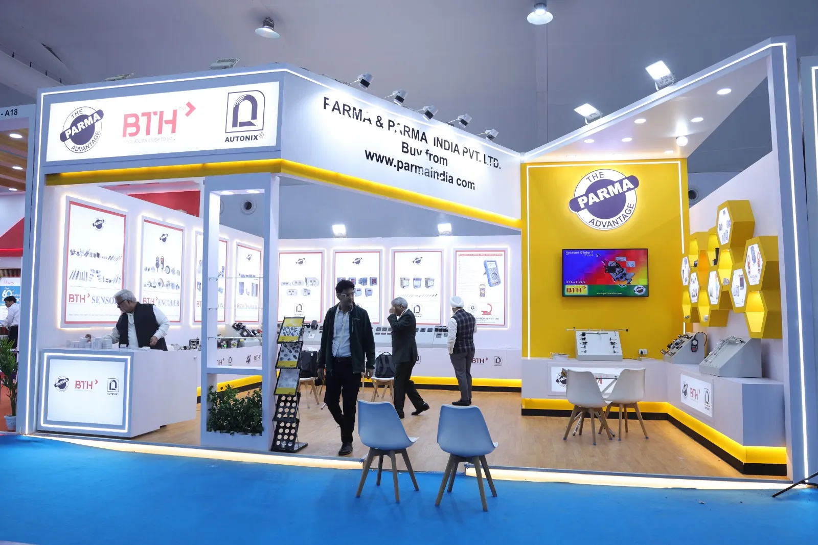
Three seconds to be understood
Visitors walk past hundreds of stalls. Your headline is not your company name, it is what you do. One line, placed high, readable from across the aisle, in plain language.
Company logos belong on the fascia. The value proposition belongs at eye level where a walking visitor will actually read it.
Design for entry, not for display
Stalls that are walled off with counters across the front look tidy and perform badly. People do not walk into enclosed spaces they cannot see through.
Keep at least sixty percent of the aisle facing side open, place counters to the side rather than across the entrance, and leave a clear floor path into the stall.
Lighting does more work than graphics
Exhibition halls have flat overhead lighting that drains colour. Add focused lighting on your product display and on the headline wall.
A well lit stall of nine square metres will consistently outperform a poorly lit stall twice its size.
Show the product, not a brochure rack
Visitors remember what they touched. Put the actual product, a working demo, or a physical sample at the centre of the layout, at a height where people can reach it.
Keep printed material at the exit point of the conversation, not the entry point.
Brief the team before the show opens
The stall does not sell, the team does. Brief everyone on the opening question, the two minute pitch, who handles technical queries, and how leads are recorded.
Set a simple rule that no one sits down and no one stands with folded arms at the front. Both signals stop visitors from approaching.
Capture leads properly
A stack of business cards is not a lead list. Record the company, the requirement, the timeline, and the next action against every conversation, on the same day.
Follow up within seventy two hours while the visitor still remembers the conversation. Most exhibition value is lost in the week after the show, not during it.